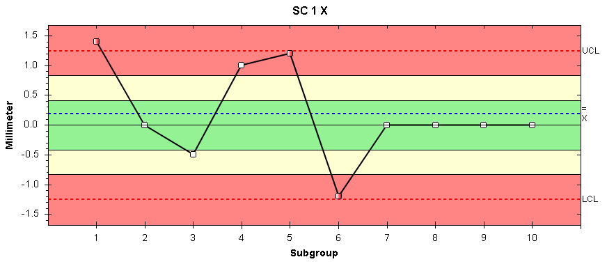
An X-Bar chart displays the averages of a dataset. The average of each subgroup is calculated and plotted as a point on the line chart. This data is shown centered around the blue dotted line, X Double Bar (an average of the averages). Upper and lower control limits are also displayed.
An X-Bar chart is useful for seeing how trends are developing and to see how close to the nominal the average is. This is helpful information when re-calibrating a machine for instance.
The colored zones identify how far each datapoint is from the target value (note that the target value is different from X Double Bar).
The zones work as follows:
 0-1 sigma from target value
 1-2 sigma from target value
 >2 sigma from target value
These sigma values are used to calculate whether or not a system is in control.
For a full list of the Nelson rules see here.
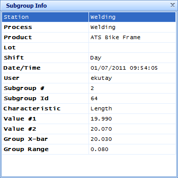
You can view the information related to a subgroup by clicking on the relevant data point. A popup will appear similar to the one shown below: