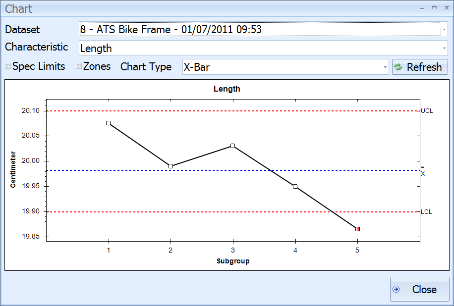
This is the part where you can see what all your hard work has been leading to. The charts.
These charts allow you to track the measurements that you've taken and see if any trends are developing.
In this section we will see the different ways in which you can view the entered data:
1. In the Main screen click the Charts button.
The following screen is displayed:

The last dataset you entered is displayed.
2. Enable Zones.
The chart now looks as follows:
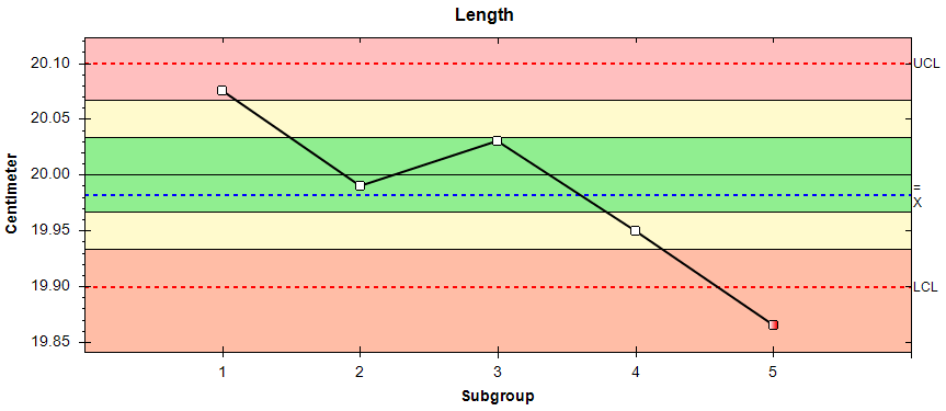
The colored zones identify how far each datapoint is from the target value.
The zones work as follows:
 0-1 sigma from target value
 1-2 sigma from target value
 >2 sigma from target value
These sigma values are used to calculate whether or not a system is in control.
For a full list of the Nelson rules see here.
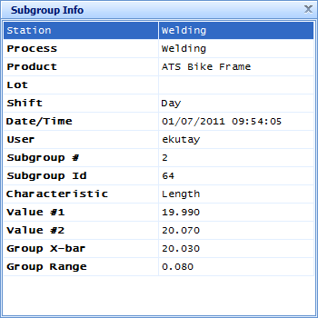
3. Click on one of the datapoints.
The information for that subgroup is displayed as shown below:
4. Click the cross in the top-right corner to close the Subgroup Info popup.
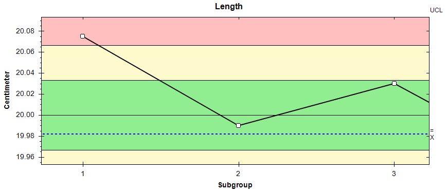
5. Click and drag a square around the first three data points.
When you release the view will zoom into the selected area.
6. Click the Refresh button to return to the original view.
You can now change the Characteristic and Chart Type as you like to view any other information you wish to see.
For information on all of the available charts and how to read them see here.