In this Topic Hide
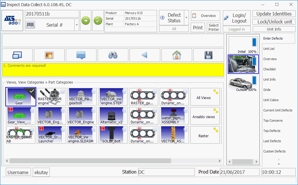
The Main screen is usually the first screen seen after the inspector logs into Data Collect. The main screen typically contains the product ID, other build content, model or product styles, and the inspection images and/or buttons.
Although there are only a few Form Specific controls this form will usually contain a lot of items from the ATS Shared selection in the Toolbox.
When the Defect Source Filter is on, the # of Concerns and # of Open Concerns fields are usually not the same as the total number of concerns. To see the total of each, turn the filter off again.
The Main screen will contain more information than any other screen so it should be designed carefully. The following information will help you with some of the key elements of the Main screen.
This is an essential tool that allows the operator to access all the information they need without leaving the Main screen. Each tab can contain one or more controls.
Add, remove and rename tabs using the Smart Tag options.
The Goto Unit control allows the user to select a unit using the unique serial number or other identifying number.
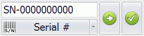
A mask can be used to specify the length and configuration of the entered value. The data entry mask is modified in Cockpit.
The Smart Tag allows you to show or hide the Go, Clear and Commit buttons as well as select the Default Identity Type. that will be selected when Data Collect is first run (e.g. Serial).
Inspection Steps allow a highly complex inspection procedure to be broken down into more manageable steps. The operator must begin with the first inspection step and cannot proceed to the next step until the previous step has been completed. Completion will be accomplished by answering all checklist questions assigned to the step.
In the Smart Tag options you can modify the following options:
● Show Progress: If enabled a progress bar with a % completion underneath it is shown. If disabled it will just show a red cross (not 100% completed) or a green checkmark (100% completed).
● Tile Orientation: Select whether the operator scrolls through the tiles from left to right (horizontally) or up and down (vertically).
● Tile Size: Change the size of the tiles the operator will click on.
It would be useful to place the step control in the same tab as the Defect control as shown in the example below.
The Defect control allows the operator to enter defects onto a product. The operator either places defects on an image of the product or they use buttons to select the component containing the defect. The following key properties can be modified. Some properties may only be displayed in Expert Mode:
● Show Images: Displays images in the buttons where available.
● Max Comment Length: Specify the maximum length for a comment.
● Show Find
Panel: Allows the operator to carry out a text search for the required
repair. It an also be displayed by clicking  .
.
● Tile Orientation: Select whether the operator scrolls through the tiles from left to right (horizontally) or up and down (vertically).
● Tile Size: Change the size of the tiles the operator will click on.
● Show Qty: Allows the operator to enter multiple defects with the same settings in the same location.
● Show Track Number: Displays the track number identifier.
● Caption Track Number: Modify the caption for the track number.
The Checklist control displays checklist questions for the current step together with possible answers, comments and reference documents.
The questions can be filtered by clicking the Status button. It will either show all questions, unanswered questions or questions that were answered incorrectly.
The following key properties can be modified. Some properties may only be displayed in Expert Mode:
● Answer Tile Size: Change the size of the answer tiles the operator will click on.
● Answer Tile Orientation: Select whether the operator scrolls through the tiles from left to right (horizontally) or up and down (vertically).
● Image Tile Size: Change the size of the image tiles the operator will click on.
● Image Tile Orientation: Select whether the operator scrolls through the tiles from left to right (horizontally) or up and down (vertically).
● Max Comment Length: Specify the maximum length for a comment.
● Show Find
Panel: Allows the operator to carry out a text search for the required
repair. It an also be displayed by clicking .
The Report Viewer control displays a customizable Microsoft SSRS report. The report can auto-refresh after Data Collect has been launched by modifying the auto-refresh interval when the report is designed.
The report shown is selected by entering the following parameters either in the Smart Tag or in the properties pane of the control :
● Report Server: Address of report server
● Report Path: This will be in the following format <folder>/<database name>/<report collection>/<report name>
● User: User with access to the report server.
● Password: Password for the user.
Example:
● Report Server: http://ATSReports333/SSRS2012
● Report Path: /InspectReports/TJ_Database_055/Defect/Concern Ranking (119)
● User: InspectUser
● Password: ATSInspect
When Analyse mode is turned
on, by clicking  , the operator
can view information about a defect by clicking on it. The information
will be displayed in the Defect Info
Grid.
, the operator
can view information about a defect by clicking on it. The information
will be displayed in the Defect Info
Grid.
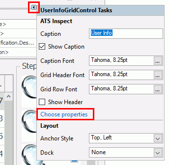
To select the information that will be displayed in the control click on its smart tag and select Choose properties. You can then enable the properties you want to display. The property description can be modified in the Property Info pane within the properties window.
The Main screen utilizes the following controls:
Control |
Used to perform this action |
Defect Status Toggle Button |
Select whether to add, repair or remove a defect. |
Login Toggle Button |
Login or logout. |
Audit List Grid |
Displays all audits performed on the current unit. |
Audit Property Control |
Displays the properties of the current audit. All properties can be modified. |
Step Control |
Divide an inspection into separate steps. |
| Control | Used to perform this action |
| Audit - Info Panel | Displays multiple audit properties in a grid. Select Choose
properties in the smart tag to modify. in the smart tag to modify.
|
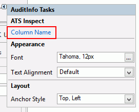
| Audit Info | Displays the value of an audit property. Select Choose
column in the smart tag to modify.
|
| Change Password Control | User can change password by entering the current password and then entering the new password. |
| Checklist Control | Displays checklist questions for the current step together with possible answers, comments and reference documents. |
| Current Unit Defects Grid | Lists the defects associated to the unit that is being viewed. |
| Custom Defects Grid | Lists part/concern/repair shortcuts specified by user. |
| Date Label | Displays the current date |
| Defect-Info Grid | Contains additional information to that displayed in the Overview window, including recording area/cell, repair area/cell, responsible area/cell and any associated images. |
| Defect Control | Displays the views, view categories and part categories into which defects can be placed. |
| Generic Checkbox | Enable or disable option. |
| Generic Combobox | Select one or more options. |
| Generic Date Picker | Select a date. |
| Generic Grid | A customized table of information. |
| Generic ListBox | Select from a customized list. |
| Generic TextEdit | Custom data entry box. |
| Goto Generic Form Button | Click to go to a specified Generic form. |
| Goto Unit Button | Select identity type, enter identity number and click to go to selected unit. |
| Group Control | Allows components to be grouped together in the form. When the group control is moved all the components it contains will also be moved. |
| Last Defects Grid | Lists the most recently entered defects. |
| Overview Control | Contains the defects related to the current unit and allows you to perform several actions on the defects and repairs. |
| Picture | Displays an image. Can be used to add a logo to the form. |
| Print Ticket Button | Click to print a travel ticket. |
| Product Document Control | Lists documents associated to the currently selected product. |
| Question Document Control | Lists documents associated to the currently selected question. |
| Repair - Info Grid | Displays repair information. |
| Report Viewer | Displays a customizable
Microsoft SSRS report. The report can auto-refresh after Data
Collect has been launched by modifying the auto-refresh interval
when the report is designed.
|
| Select Printer Button | Open the Select Printer form. |
| Shell Button | Runs a command line script to carry out actions outside Data Collect (e.g. open files, run applications). |
| Shift Info | Displays the current shift. |
| Static Label | Displays customizable text. can be used to add extra information to the form. |
| Station - Info Grid | Lists available stations that can be selected. |
| Station Info | Displays the station that is being used. |
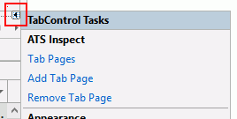
| Tab Control | Customizable tab control. Allows more than one set of information to be displayed in the same area of the form. They can be switched between by selecting the required tab. |
| Time Label | Displays the current time. |
| Top Concerns Grid | Lists the most common concerns at the station. |
| Top Defects Grid | Lists the most common defects at the station. |
| Unit - Info Grid | Displays information about the current unit. |
| Unit Color Grid | Lists the colors associated to the current unit. |
| Unit Info | Displays the ID of the current unit. |
| Unit List Grid | Displays a list of the units in the production line. The current unit is shown in the middle and highlighted. The units that have already passed through are below, and those yet to come are above. If a unit has passed through more than once only the latest pass will be shown. |
| Unit Lookup Code Grid | Lists the lookup codes associated to the current unit. |
| Use Defect Source Check Button | Specify whether the defects shown on travel tickets were entered at this station or at all stations. |
| User - Info Grid | Displays information about the current user. |
| User Info | Displays the name of the current user. |
| User Picture | Displays a picture of the current user. |
| Web Browser | Displays a web browser window. Useful for displaying online help. |