Annotation Styles
Arrow Styles
Grids
Views

In this Topic Hide
In View Composer it's possible to create standard annotation, arrow, font, pen and fill styles. These are used to control the look of grids, arrows and annotations that are used in views in Data Collect.
Font, pen and fill styles can also be configured in Cockpit (see here).
Once defined font, pen and fill styles can be assigned to annotation styles, arrow styles, grids and views as follows.
| Style | Annotation Styles |
Arrow Styles |
Grids |
Views |
| Font |
|
|
|
|
| Pen |
|
|
|
|
| Fill |
|
|
|
|
Annotation and arrow styles also have a couple of extra settings of their own.
Font styles are used when creating annotation styles and grid styles.
1. Select the Management tab.
2. Click Font.
A list of the available font styles is shown. The right pane displays a preview of the selected style and by selecting the tabs in the lower pane you can see where the style is referenced.
A style cannot be deleted while it is still referenced.
3. Click the Add
button ( ).
).
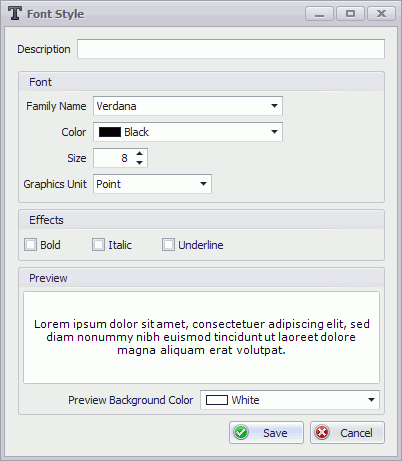
4. Enter a description for the font style.
5. Specify the font style settings. A preview will be shown in the bottom pane.
6. Click Save.
The font style is added to the list.
Pen styles are used to define the outline of annotations and arrows and for grid lines.
1. Select the Management tab.
2. Click Pen.
A list of the available pen styles is shown. The right pane displays a preview of the selected style and by selecting the tabs in the lower pane you can see where the style is referenced.
A style cannot be deleted while it is still referenced.
3. Click the Add
button ().
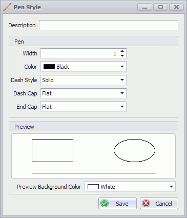
4. Enter a description for the pen style.
5. Specify the pen style settings. A preview will be shown in the bottom pane.
6. Click Save.
The pen style is added to the list.
Fill styles are used to define the fill for annotations, arrows and grids. They can also be selected as a fill for components when they're drawn on a view.
1. Select the Management tab.
2. Click Fill.
A list of the available fill styles is shown. The right pane displays a preview of the selected style and the tabs in the lower pane show where the style is referenced.
A style cannot be deleted while it is still referenced.
3. Click the Add
button ().
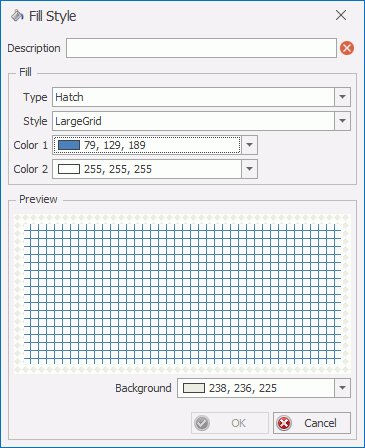
4. Enter a description for the fill style.
5. Select a Type of fill (Solid, Hatch or Linear Gradient). If you select Hatch you will also need to select a Style.
A preview will be shown in the bottom pane.
6. Select the required colors from the drop-down menu. If you want to create your own color, or if you want to use a fill with a level of transparency, click More Colors at the bottom of the drop-down menu to create a new color.
If the fill type is Hatch or Linear Gradient then the second color will need to be different for it to be seen.
To have a grid with no fill color change the opacity of the fill color to 0.
7. Click Save.
The fill style is added to the list.
An annotation can help highlight small, awkward to select components. When the operator selects an annotation linked to a component it registers a defect in the center of the component. Alternatively, annotation can simply be used to label different parts of the image or to act as reminders of what to look out for.
Remember that modifying an existing annotation style will modify all existing annotations that use that style. This may cause unexpected/unwanted display results, such as if text is made significantly larger or smaller. It is usually recommended to create a new annotation style rather than modify an existing one so that your previous work is not affected.
1. Select the Management tab.
2. Click Annotation.
A list of the available annotation styles is shown. The right pane displays a preview of the selected style and the lower pane shows which views are using the style.
A style cannot be deleted while it is still referenced.
3. Click the Add
button ().
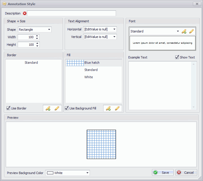
4. Enter a description for the annotation style.
5. Specify the shape, width and height.
The width and height of the annotation cannot be modified within the view.
A preview will be shown in the bottom pane. You can change the preview background color at the bottom of the window.
6. Specify the text alignment.
In the Vertical list Nearer means Top. In the Horizontal list Nearer means Left.
7. Select a border, fill and font style.
To see how the text will look you can enter text in the right-hand pane.
8. Click Save.
The annotation style is added to the list.
1. Select the Management tab.
2. Click Arrow.
A list of the available arrow styles is shown. The right pane displays a preview of the selected style and the lower pane shows which views are using the style.
A style cannot be deleted while it is still referenced.
3. Click the Add
button ().
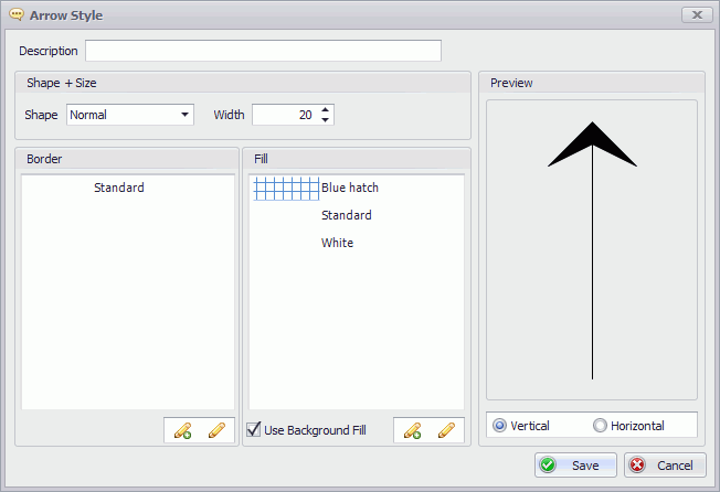
4. Enter a description for the arrow style.
5. Specify the shape and width.
The shape and width of the arrow cannot be modified within the view.
A preview will be shown in the right-hand pane.
6. Select a border and fill style.
7. Enable Use Background Fill at the bottom of the window for the fill to be used.
8. Click Save.
The arrow style is added to the list.