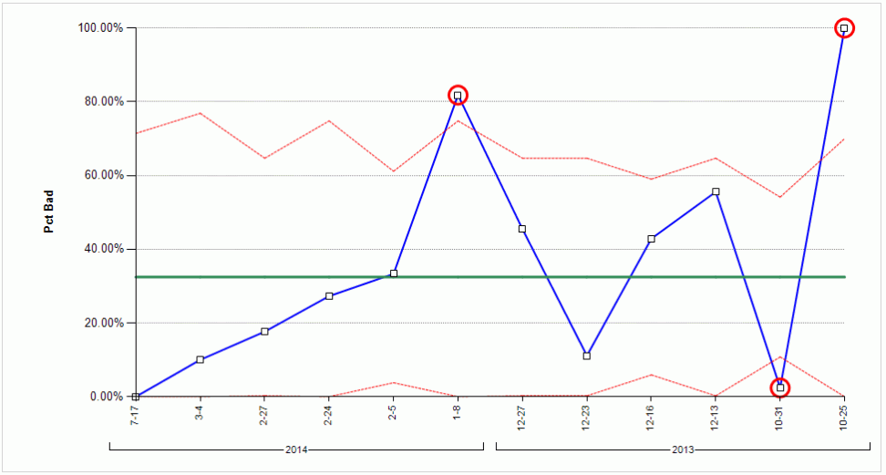
This report displays the change over time of the proportion of units within a given sample size that have at least one defect.
It displays a chart and a table illustrating the control level of plant manufacturing.
To use this chart set a base date (the date from which the report starts) and then enters the number of days the chart will cover.
The line chart for the p Chart Report displays a graphical representation of the percentage of bad units.

There are four lines contained in the line chart. They are as follows:
● Top Red Dashed Line – Upper Control Limit (UCL)
● Bottom Red Dashed Line – Lower Control Limit (LCL)
● Solid Green Line – Middle of the two control limits
● Solid Blue Line – Pct. Bad
When the data points fall outside of the upper and lower control limits the manufacturing process is considered to be uncontrolled. Those points have a red circle around them.
The table for the p Chart Report displays the following information for each of the days in the range.
● Pct Bad - The percentage of units on the given day that have at least one defect.
● Defects - The number of defects that occurred on the day.
● Sample- The size of the sample on the given day.

| Parameter | Description |
Desired Language |
The language the report results will be shown in. |
Date Range |
Specify a date range i.e. Today, Yesterday, Last Week etc. |
Begin Date |
The start date for the report. |
End Date |
The end date for the report. |
Shift |
The shifts to be included in the report. |
Defect Area/Group/Station |
The production area, station group or station where the defects were assigned. |
Product/Group |
The product(s) and product group(s) to be included in the report. |
Model Year |
The model year to be included in the report. |
Build Group |
The build group(s) to include in the report. |
Tracking Point/Group |
Selecting the appropriate tracking point or group will provide the sample
size for the report. That is, the number of units that crossed through
that point or group matching with the rest of the filters selected in
the report.
|
Restrict to Units in Sample |
Only count defects that went through the specified tracking point. |
Responsible Area |
The area responsible for the defects occurring. |
Responsible Cell |
The cell responsible for the defects occurring. |
Part(s) |
The part(s) to include in the report. |
Concern(s) |
The concern(s) to include in the report. |
Rank |
The rank(s) to include in the report. |
Min Sample |
Samples of units smaller than this will not be included. |
Marker Size |
The size of the markers on the Pct Bad line. |
Min Y-Axis Value |
The minimum value for the Y-axis. |
Max Y-Axis Value |
The maximum value for the Y-axis. |