In cases where your Chart contains one or more points that you do not want to include in the chart's calculations, you can mask those points by applying Assignable Causes.
1. In a chart which contains a point you want to assign a cause label to, move the mouse pointer over the marker of the point. The pointer will switch from an arrow to a cross-hair.
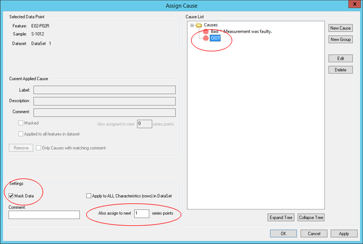
2. With the cross-hair cursor over the marker, right click and select Assign Cause. The Assign Cause dialog will appear.
3. Select a cause from the Cause List.
4. Select the check box next to Mask Data.
5. If there is more than one point in the series that you want to mask, enter an integer in the Also Assign to Next __ Series Points.
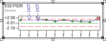
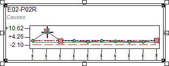
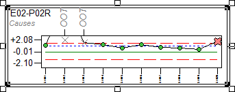
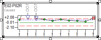
6. Click OK to save your changes and exit the Assign Cause dialog. Notice that the points are now X marks (the marker type is configurable), and the inter feature lines are now gray and dashed (also configurable).
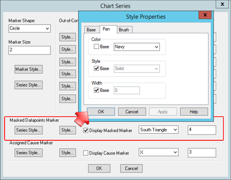
7. The properties of the masked markers can be edited in the Masked Datapoints Marker section of the Chart Series dialog.
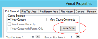
8. The font style of the Cause Labels can also be changed in the Annot Properties dialog. Click Cause Style to edit the font size, weight style, and color.