The charts allow you to track the measurements that you've taken and see if any trends are developing.
These are the available chart types. Click on the names to see a full description of the charts and how they are used.
o Range
o X-Bar
o Pie
The names of the charts can be modified in Cockpit. See here.
In this section we will see the different ways in which you can view entered data.
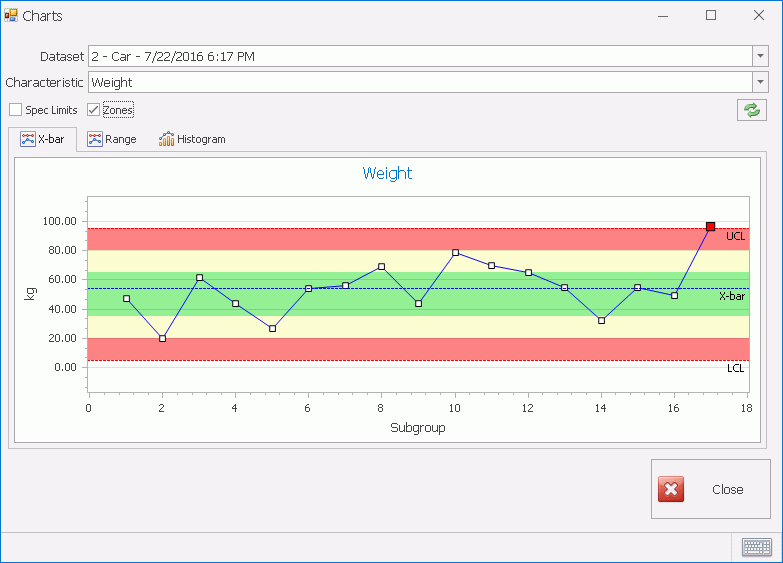
1. In the Main screen click the Charts button.
The following screen is displayed:
2. Select a Dataset from the drop-down list.
3. Select a Characteristic from the drop-down list.
4. Select a chart type from the available tabs.
The Zones checkbox is only applicable to the X-Bar chart. It allows you to view the colored zones which identify how far each datapoint is from the target value.
The zones work as follows:
 0-1 sigma from target value
 1-2 sigma from target value
 >2
sigma from target value
>2
sigma from target value
These sigma values are used to calculate whether or not a system is in control.
For a full list of the Nelson rules see here.
The Spec Limits check box allows you to see the UCL, LCL and Nominal on the charts.
For further information on specification limits see here.
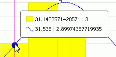
Moving the mouse along the chart will display the exact height of the histogram bar, the quantity of recordings at that value the exact value itself.