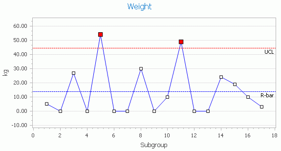
A Range chart displays the spread of observations. Each point in the chart shows the range for an individual subgroup.
Each point in the chart is calculated by subtracting the lowest sample from the highest sample in the subgroup. For example, in the chart below the first data point shows a value of 0.05 cm. The values entered for that subgroup were 20.1 and 20.05. By deleting the lowest value (20.05) from the highest (20.10) we get the range of 0.05.
Each subgroup produces a point on the chart as shown. The average of these point is indicated by the R line.

Range is important so that you can tell if the entire process is shifting and by how much, or if the shifting is just during certain times. This may happen, for example, when material from supplier X starts being pulled from stock, or when the environmental variables change.
The closer the points are to zero the better controlled the process is. However, this does not tell you if the values are near the nominal (target value) or not. For this you should use the X-Bar chart.
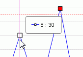
Moving the mouse along the chart will display the value and subgroup at that point..
