Topic Contents: Hide
Occasionally you may want to leave out or flag certain data by assigning a small note, called a Cause, to the data. The cause will appear parallel to the marker, on the opposite side of the horizontal axis. Additionally, a marker or series of markers can be masked.
Causes can only be assigned (or removed) by users with the Modify Actual privilege. For more information, please refer to the Privileges topic in the Site Manager Help Documentation.
Causes can be assigned to data in X-Bar, X-MR, X-Bar & S, X-Bar & R, and Trend charts. Once data has been assigned a cause, the cause is stored with the data in the database. Any time that data appears in one of the previously listed annotation, the cause will appear as well.
It is possible to assign causes to graph annotation, but it is not recommended.
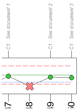
Cause labels are intended to be very short, usually one word. If additional information is required, use the description field. Using Causes to mask data can help you to better display your data. Extreme outliers can cause the range of your plot space to expand much farther than it would normally. Before assigning a cause, your data might look like a straight line with a large upward or downward spike. When an outlier is assigned a cause and masked, it will not be included in the calculation of the plot space, and your data will be more clearly represented in the chart. CM4D will treat the masked data as an invalid point. How CM4D treats an invalid point depends on the Statistics Rules chosen in the Document Defaults.
It is a good practice to save your document after creating causes. When you create causes, they are stored in the database the next time the database is updated. This usually happens whenever you refresh a query, edit a feature, or create a subroutine. If you close your document without saving or updating to the database, your causes could be lost. For information on how to assign causes to values which exceed the reasonable limits, see the topics Reasonable Limits and Assign Cause to Unreasonable.
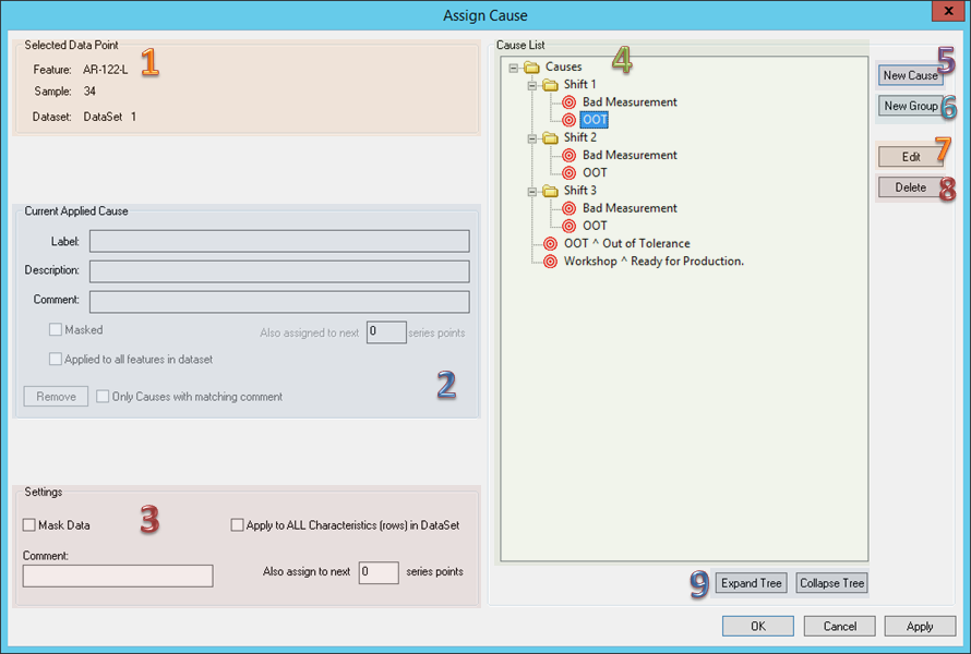
Displays information regarding the point currently being assigned a Cause - Feature label, Sample label, and DataSet label.
If a cause has already been applied to the data, the label and description (as well as information about how the cause was applied) will be displayed.
Applied causes can be removed by clicking the Remove button. If the Only Causes with matching comment check box is selected when the Remove button is clicked, any causes in the series with comments matching the currently selected cause will be removed.
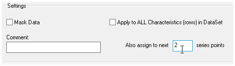
Selecting the check box next to Mask Data will replace the marker with an X mark and will treat the data as an invalid point. Selecting the check box next to Apply to All Features in DataSet will apply the cause to all the features in the DataSet. Also Assign to Next __ Series Points will assign the cause to the selected point, and also to the number of points entered. For example, if you were to enter 2, the cause would be assigned to the currently select point and the next two points. A total of three points would be masked.
While deleting an entire sample that is bad (part was badly clamped, it was run over by a hi-lo, etc.) may at times be appropriate, there will be other times when a good reading has one erroneous point. This could be a DataMyte error at one SPC point, a damaged hem flange, or perhaps another reason. The following steps will walk you through masking, and making comments on bad readings.
Keep in mind, that while you will only appear to be performing these actions (the masking of data) on one point, the masking will actually occur in the database, not just in the template. Therefore, a masked point will NOT be used to calculate Cp/Cpk, range, or any other calculations. Furthermore, whenever this routine is accessed, it will have this sample masked (unless it is unmasked).
If masking data in a regular CM4D template, either I-MR or X-Bar & R DataSets must first be converted to an Individual Value (Trend/Run) Type.
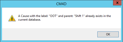
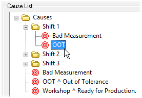
The Cause List displays all of the previously created causes and their descriptions. Causes and Groups may be dragged and dropped into any custom organization desired, as with any Windows© folders. Causes are defined in the Database by the Group and the Cause label, so you may have duplicate Causes as long as they belong to different Groups. If you try to create a duplicate Cause within a Group, the following warning will appear, and you will not be permitted to create that Cause.
Causes that are used with Process Baselines are only used as descriptors and cannot be used to mask data.
Clicking New Cause will create a New Cause. Define the Cause Label and click OK. If no group is selected when the New Cause button is clicked, the Cause will be added to the root Cause by default.
Clicking New Group will create a New Group. Groups may be used to organize Causes, as well as differentiate two or more causes which might have the same label.
The Edit button will open the Edit Cause dialog. Only the description of a Cause may be modified once it has been added to the database.
Clicking Delete will delete all occurrences of the selected cause. A cause will not be removed if it has been used in a process baseline.
Use the Expand Tree or Collapse Tree to open or close all existing Cause Groups at once.
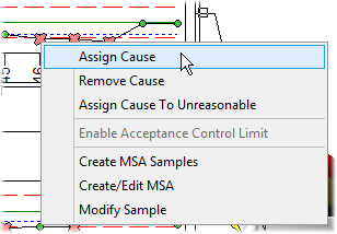
1. In a chart which contains a point you want to assign a cause label to, move the mouse pointer over the marker of the point. The pointer will switch from an arrow to a cross-hair ( ).
).
2. With the plus cross-hair over the marker, right click and select Assign Cause.
3. The Assign Cause dialog will appear.
4. Select a cause from the Cause List.
5. If you would like to mask the data, select the check box next to Mask Data.
6. If you would like to apply the cause to all of the features in the DataSet, select the check box next to Apply to all features in DataSet.
7. If you would like to apply the same cause to a number of consecutive points in the chart, enter a value in Also assign to next __ series points.
8. Click OK to assign the cause to the data and close the dialog.
9. The cause will now be assigned to the point selected.
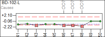
Values that have been assigned causes will display a # sign when viewed in the DataSet grid.
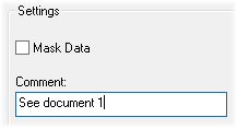
Cause Comments can be used in addition to Cause Labels to customize the display of marked data when a cause has been assigned. Comments can be added to a single point or to a series of consecutive points. To assign a comment, select a cause label from the list of available labels or create a new cause label, then enter a Comment in the Settings region of the Assign Cause dialog. Select the Also assign to next __ series points check box to assign identical comments to a series of consecutive points.
In some cases, you may want to create a unique comment for individual points that share the same cause label and description:
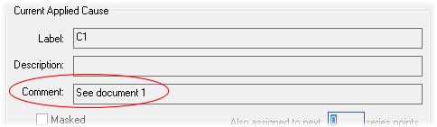
1. Open the Assign Cause dialog and select a cause label from the Cause List.
2. In the Settings region, enter a comment and click Apply.
3. Your settings will appear in the Current Applied Cause section of the dialog. Click OK.
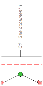
4. If the View Cause Comment check box is selected in the Chart Plot Space dialog, the cause comment will appear next to the cause label at the top of the control chart.
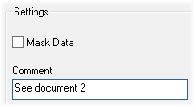
5. Choose another point, open the Assign Cause dialog, and select the same Cause Label from the list that was assigned to the previous point.
6. Enter a different comment for the second cause and click Apply.
7. Your new comment settings will appear in the Current Applied Cause section of the dialog. Click OK.
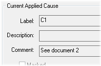
8. Continue assigning different comments along with the same cause label to each point as desired. As a result, the cause labels and comments appearing in your chart could resemble the following:
See also the variables ~act,cause,comment~ and ~cause,comment~.